Excel is the most important and powerful search marketing tool. In PPC Management, Excel is a must-have tool in addition to AdWords (adCenter) Editors. Building keyword lists, writing ad copy, analyzing data and preparing reports – all these tasks mostly done using Excel. Most of our optimization time we spend cranking Excel spreadsheets and log in AdWords or adCenter web-UI only to get status updates or make some minor changes. Don’t get me wrong: same tasks can be performed in the web-UI, but Excel allows us to streamline the process and get a better use of our time. So, here are some tips to help you work with your PPC data more efficiently.
Both, AdWords and adCenter, allow you to download different kinds of reports in spreadsheets format. But in order to get them, you have to login in the UI and go through several steps to download your report. I found to be more efficient to simply copy or export data from AdWords Editor or adCenter Desktop tools. It is quick, and I can paste back changes in the desktop tool and upload them in the account right away.
Working in Excel involves a lot of copy-pasting, cleaning, reformatting and calculating. You can do it all manually, or, you can utilize powerful Excel’s functionality to get everything done more efficiently.
Microsoft Excel is one of the most widely used tools in any industry. While some enjoy playing with pivotal tables and histograms, others limit themselves to simple pie-charts and conditional formatting. Some may create an artwork out of the dull monochrome Excel, while others may be satisfied with its data analysis. In this discussion, we will make a deep delving analysis of Microsoft Excel and its utility. We will focus on how to analyze data in Excel, the various tricks, and techniques for it. The discussion will also explore the various ways to analyze data in Excel.
We will discuss the different features of Excel (much of which are unexplored to the mass), functions, and best practices.
Our discussion will include, but not be limited to:
- Best Way to Analyze Data in Excel
- How to Analyze Sales Data in Excel
- Analyzing Data Sets with Excel
- Data Segregation with Excel
- The Importance of Data Reporting
How to Analyze Sales Data in Excel: Make Pivot Table your Best Friend
A pivot tool helps us summarize huge amounts of data. One of the best ways to analyze data in excel, it is mostly used to understand and recognize patterns in the data set. Recognizing patterns in a small dataset is pretty simple. But the enormity of the datasets often calls for additional efforts to find the patterns. In such cases, a pivot table can be a huge advantage as it takes only a few minutes to summarize groups of data using a pivot table.
Say, for example, you have a dataset consisting of regions and number of sales. You may want to know the number of sales based on the regions, which can be used to determine why a region is lacking and how to possibly improve in that area. Using a pivot table, you can create a report in excel within a few minutes and save it for future analysis.
A Pivot Table allows you to summarize data as averages, sums, or counts in Excel from data that is stored in another Spreadsheet, or table. It is great for quickly building reports because you can sort and visualize the data quickly.
For example, you may have put together a spreadsheet, which you can copy, and paste into Excel, or use in Google Docs if you would prefer (just click File > Make a Copy). The spreadsheet contains data with a mock company’s customer purchase information. Since companies purchase at different dates, a pivot table will help us to consolidate this data to allow us to see total buys per company, as well as to compare purchases across companies, for quick analysis.
The Pivot table allows you to take a table with a lot of data in it and rearrange the table so that you only look at only what matters to you.
- a) Whether you are using a Mac or a PC, you can select the whole dataset that you want to look at and select: “Data” -> “Pivot Table”. When you hit that, a new tab should be opened with a table.
Data Set
- b) Once you have your table in front of you, you can drag and drop the Column Labels, Row Labels, and Report Filter
- Column Labels go across the top row of your table (for example Date, Month, Company Name)
- Row Labels go across the left-hand side of your table [for example Date, Month, Company Name (same as with column labels, it depends on how you would prefer to look at the data, vertically or horizontally)]
- The Values section is where you put the data you would like calculated (for example Purchases, Revenue)
- Report Filter helps you refine your results. Add anything you would like to Filter by (for example you want to look at Lead Referral Sources, but exclude Google and Direct)
Pivot tables are a great way to manage the data from your reports. You can copy and paste the data into your own Excel file, or create a copy in Google Apps (File > Make a Copy).

How to Analyze Data in Excel: Analyzing Data Sets with Excel
You can instantly create different types of charts, including line and column charts, or add miniature graphs. You can also apply a table style, create PivotTables, quickly insert totals, and apply conditional formatting. Analyzing large data sets with Excel makes work easier if you follow a few simple rules:
- Select the cells that contain the data you want to analyze.
- Click the Quick Analysis button image button that appears to the bottom right of your selected data (or press CRTL + Q).
- Selected data with Quick Analysis Lens button visible
- In the Quick Analysis gallery, select a tab you want. For example, choose Charts to see your data in a chart.
- Pick an option, or just point to each one to see a preview.
- You might notice that the options you can choose are not always the same. That is often because the options change based on the type of data you have selected in your workbook.

You might want to know which analysis option is suitable for you. Here we offer you a basic overview of some of the best options to choose from.
- Formatting: Formatting lets you highlight parts of your data by adding things like data bars and colors. This lets you quickly see high and low values, among other things.
- Charts: Charts Excel recommends different charts, based on the type of data you have selected. If you do not see the chart you want, click More Charts.
- Totals: Totals let you calculate the numbers in columns and rows. For example, Running Total inserts a total that grows as you add items to your data. Click the little black arrows on the right and left to see additional options.
- Tables: Tables make it easy to filter and sort your data. If you do not see the table style you want, click More.
- Sparklines: Sparklines are like tiny graphs that you can show alongside your data. They provide a quick way to see trends.

Ways to Analyze Data in Excel: Tips and Tricks
It is fun to analyze data in MS Excel if you play it right. Here, we offer some quick hacks for success.
How to Analyze Data in Excel: Data Cleaning
Data Cleaning, one of the very basic excel functions, becomes simpler with a few tips and tricks. You may learn how to use a native Excel feature and how to accomplish the same goal with Power Query. Power Query is a built-in feature in Excel 2016 and an Add-in for Excel 2010/2013. It helps you to extract, transform, and load your data with just a few clicks.
1. Change the format of numbers from text to numeric
Sometimes when you import data from an external source other than Excel, numbers are imported as text. Excel will alert you by showing a green tooltip in the top-left corner of the cell.
Depending on the number of values in the range, you can quickly convert the values to numbers by clicking on ‘Convert to a number’ within the tooltip options.
However, if you have more than 1000 values, you will have to wait a couple of seconds while Excel finishes the conversion.
You may also convert the values to number format is to use Text-to-Columns using the following steps:
- Select the range with the values to be converted.
- Go to Data > Text to Columns.
- Select Delimited and click Next.
- Uncheck all the checkboxes for delimiters (see below) and click Next.
- Text-Columns-Checkboxes
2. Select General and click on Finish
When you have lots of numbers to convert this tip will be much faster than waiting for all the numbers to be converted. In Power Query, you just have to right click on the column header of the column you want to convert.
- Then go to Change Type.
- Then select the type of number you want (such as Decimal or Whole Number)
- Power-Query-Data-Type
How to Analyze Data inExcel: Data Analysis
Data Analysis is simpler and faster with Excel. Here, we offer some tips for work:
- Create auto expandable ranges with Excel tables: One of the most underused features of MS Excel is Excel Tables. Excel Tables have wonderful properties that allow you to work more efficiently. Some of these features include:
- Formula Auto Fill: Once you enter a formula in a table it will be automatically be copied to the rest of the table.
- Auto Expansion: New items typed below or at the right of the table become part of the table.
- Visible headers: Regardless of your position within the table, your headers will always be visible.
- Automatic Total Row: To calculate the total of a row, you just have to select the desired formula.
- Use Excel Tables as part of a formula: Like in dropdown lists, if you have a formula that depends on a Table, when you add new items to the Table, the reference in the formula will be automatically updated.
- Use Excel Tables as a source for a chart: Charts will be updated automatically as well if you use an Excel Table as a source. As you can see, Excel Tables allow you to create data sources that do not have to be updated when new data is included.
How to Analyze Data in Excel: Data Visualization
Quickly visualize trends with sparklines: Sparklines are a visualization feature of MS Excel that allows you to quickly visualize the overall trend of a set of values. Sparklines are mini-graphs located inside of cells. You may want to visualize the overall trend of monthly sales by a group of salesmen.
To create the sparklines, follow these steps below:
- Select the range that contains the data that you will plot (This step is recommended but not required, you can select the data range later).
- Go to Insert > Sparklines > Select the type of sparkline you want (Line, Column, or Win/Loss). For this specific example, I will choose Lines.
- Click on the range selection button Select Range Excel Button to browse for the location of the sparklines, press Enter and click OK. Make sure you select a location that is proportional to the data source. For example, if the data source range contains 6 rows then the location of the sparkline must contain 6 rows.
To format the sparkline you may try the following:
To change the color of markers:
- Click on any cell within the sparkline to show the Sparkline Tools menu.
- In the Sparkline tools menu, go to Marker Color and change the color for the specific markers you want.
For example High points on the green, Low points on red, and the remaining in blue.
To change the width of the lines:
- Click on any cell within the sparkline to show the Sparkline Tools menu.
- In the Sparkline tools contextual menu, go to Sparkline Color > Weight and change the width of the line as you desire.
Save Time with Quick Analysis: One of the major improvements introduced back in Excel 2013 was the Quick Analysis feature. This feature allows you to quickly create graphs, sparklines, PivotTables, PivotCharts, and summary functions by just clicking on a button.
When you select data in Excel 2013 or later, you will see the Quick Analysis button Quick Analysis Excel Button in the bottom-right corner of the range selected. If you click on the Quick Analysis button you will see the following options:
- Formatting
- Charts
- Totals
- Tables
- Sparklines
When you click on any of the options, Excel will show a preview of the possible results you could obtain given the data you selected.
- If you click in the Quick Analysis button and go to charts, you could quickly create the graph below just by clicking a button.
- If you go to Totals, you can quickly insert a row with the average for each column:
- If you click on Sparklines, you can quickly insert Sparklines:
- As you can see, the Quick Analysis feature really allows you to quickly perform different visualizations and analysis with almost no effort.
Commonly used functions
1. Vlookup(): It helps to search a value in a table and returns a corresponding value. Let’s look at the table below (Policy and Customer). In Policy table, we want to map city name from the customer tables based on common key “Customer id”. Here, function vlookup() would help to perform this task.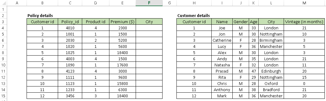
Syntax: =VLOOKUP(Key to lookup, Source_table, column of source table, are you ok with relative match?)
For above problem, we can write formula in cell “F4” as =VLOOKUP(B4, $H$4:$L$15, 5, 0) and this will return the city name for all the Customer id 1 and post that copy this formula for all Customer ids.
Tip: Do not forget to lock the range of the second table using “$” sign – a common error when copying this formula down. This is known as relative referencing.
2. CONCATINATE(): It is very useful to combine text from two or more cells into one cell. For example: we want to create a URL based on input of host name and request path.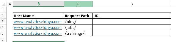
Syntax: =Concatenate(Text1, Text2,.....Textn)
Above problem can be solved using formula, =concatenate(B3,C3) and copy it.
Tip: I prefer using “&” symbol, because it is shorter than typing a full “concatenate” formula, and does the exactly same thing. The formula can be written as “= B3&C3”.
3. LEN() – This function tells you about the length of a cell i.e. number of characters including spaces and special characters .
Syntax: =Len(Text)
Example: =Len(B3) = 23
4. LOWER(), UPPER() and PROPER() –These three functions help to change the text to lower, upper and sentence case respectively (First letter of each word capital).
Syntax: =Upper(Text)/ Lower(Text) / Proper(Text)
In data analysis project, these are helpful in converting classes of different case to a single case else these are considered as different classes of the given feature. Look at the below snapshot, column A has five classes (labels) where as Column B has only two because we have converted the content to lower case.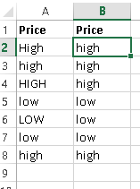
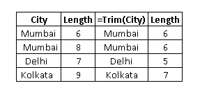
5. TRIM(): This is a handy function used to clean text that has leading and trailing white space. Often when you get a dump of data from a database the text you’re dealing with is padded with blanks. And if you don’t deal with them, they are also treated as unique entries in a list, which is certainly not helpful.
Syntax: =Trim(Text)
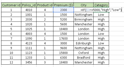
6. If(): I find it one of the most useful function in excel. It lets you use conditional formulas which calculate one way when a certain thing is true, and another way when false. For example, you want to mark each sales as “High” and “Low”. If sales is greater than or equals to $5000 then “High” else “Low”.
Syntax: =IF(condition, True Statement, False Statement)
Generating inference from Data
1. Pivot Table: Whenever you are working with company data, you seek answers for questions like “How much revenue is contributed by branches of North region?” or “What was the average number of customers for product A?” and many others.
Excel’s PivotTable helps you to answer these questions effortlessly. Pivot table is a summary table that lets you count, average, sum, and perform other calculations according to the reference feature you have selected i.e. It converts a data table to inference table which helps us to take decisions. Look at the below snapshot: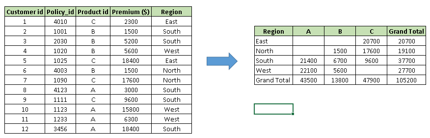 Above, you can see that table on the left has sales detail against each customer with region and product mapping. In table to the right, we have summarized the information at region level which now helps us to generate a inference that South region has highest sales.
Methods to create Pivot table:
Step-1: Click somewhere in the list of data. Choose the Insert tab, and click PivotTable. Excel will automatically select the area containing data, including the headings. If it does not select the area correctly, drag over the area to select it manually. Placing the PivotTable on a new sheet is best, so click New Worksheet for the location and then click OK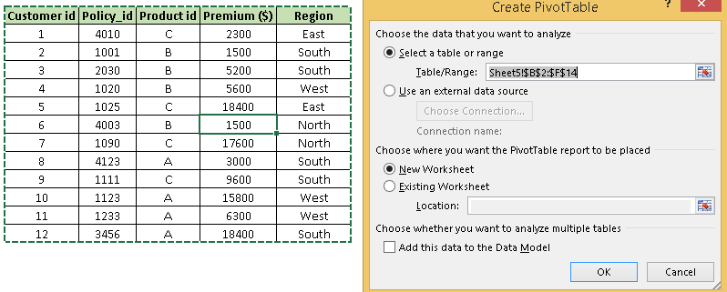 Step-2: Now, you can see the PivotTable Field List panel, which contains the fields from your list; all you need to do is to arrange them in the boxes at the foot of the panel. Once you have done that, the diagram on the left becomes your PivotTable.
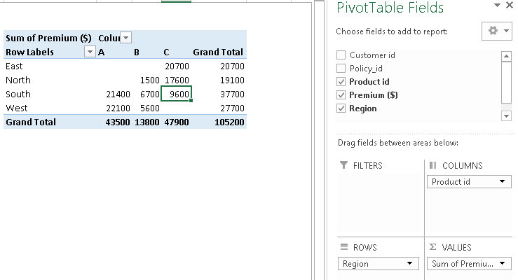 Above, you can see that we have arranged “Region” in row, “Product id” in column and sum of “Premium” is taken as value. Now you are ready with pivot table which shows Region and Product wise sum of premium. You can also use count, average, min, max and other summary metric. For more detail on Pivot table, I would suggest you to refer this link.
2. Creating Charts: Building a chart/ graph in excel requires nothing more than selecting the range of data you wish to chart and press F11. This will create a excel chart in default chart style but you can change it by selecting different chart style. If you prefer the chart to be on the same worksheet as the data, instead of pressing F11, press ALT + F1.
Of course, in either case, once you have created the chart, you can customize to your particular needs to communicate your desired message.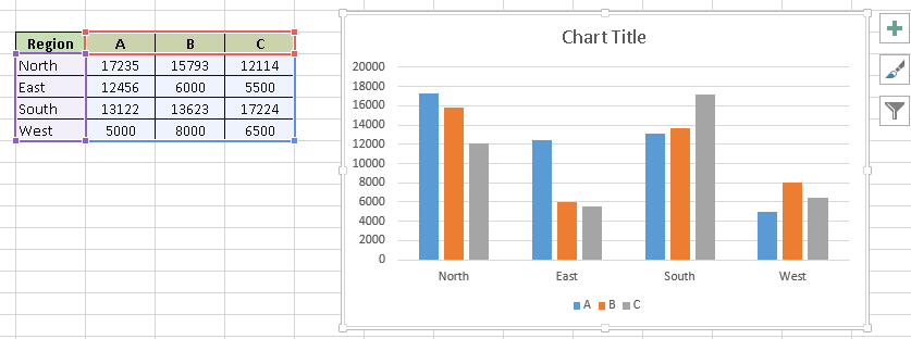 To know about different properties of charts, I would recommend to refer this link.
Data Cleaning
1. Remove duplicate values: Excel has inbuilt feature to remove duplicate values from a table. It removes the duplicate values from given table based on selected columns i.e. if you have selected two columns then it searches for duplicate value having same combination of both columns data.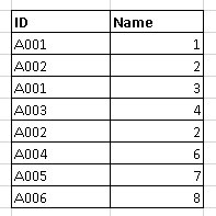
Above, you can see that A001 and A002 have duplicate value but if we select both columns “ID” and “Name” then we have only one duplicate value (A002, 2).
Follow the these steps to remove duplicate values: Select data –> Go to Data ribbon –> Remove Duplicates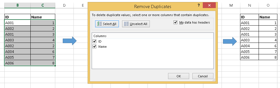
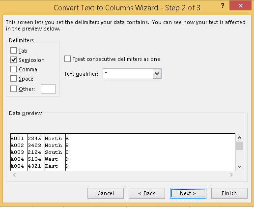
2. Text to Columns: Let’s say you have data stored in column as shown in below snapshot.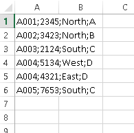 Above, you can see that values are separated by semi colon “;”. Now to split these values in different column, I will recommend to use “Text to Columns” feature in excel. Follow below steps to convert it to different columns:
- Select the range A1:A6
- Go to “Data” ribbon –> “Text to Columns”
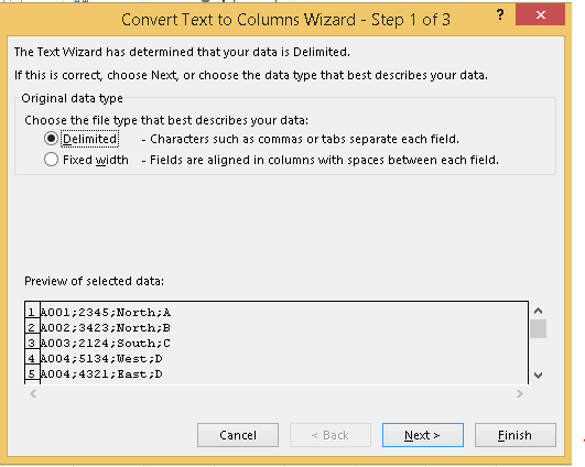 Above, we have two options “Delimited” and “Fixed width”. I have selected delimited because the values are separated by a delimiter(;). If we would be interested to split data based on the width such as first four character to first column, 5 to 10th character to second column, then we would choose Fixed width.
- Click on Next –>Mark check box on for “Semi colon” then Next and finish.
Essential keyboard shortcuts
Keyboard shortcuts are the best way to navigate cells or enter formulas more quickly. We’ve listed our favorites below.
- Ctrl +[Down|Up Arrow]: Moves to the top or bottom cell of the current column and combination of Ctrl with Left|Right Arrow key, moves to the cell furthest left or right in the current row
- Ctrl + Shift + Down/Up Arrow: Selects all the cells above or below the current cell
- Ctrl+ Home: Navigates to cell A1
- Ctrl+End: Navigates to the last cell that contains data
- Alt+F1: Creates a chart based on selected data set.
- Ctrl+Shift+L: Activate auto filter to data table
- Alt+Down Arrow: To open the drop down menu of autofilter. To use this shortcut:
- Alt+D+S: To sort the data set
- Ctrl+O: Open a new workbook
- Ctrl+N: Create a new workbook
- F4: Select the range and press F4 key, it will change the reference to absolute, mixed and relative.
Note: This isn’t an exhaustive list. Feel free to share your favorite keyboard shortcuts in Excel in the comments section below. Literally, I do 80% of excel tasks using shortcuts.
I really liked your Information. Keep up the good work. Course AZ-305: Designing Microsoft Azure Infrastructure Solutions
ReplyDelete